About Lana Yarosh

Svetlana “Lana” Yarosh is an Assistant Professor in the Computer Science & Engineering Department at University of Minnesota. Her research in HCI focuses on embodied interaction in social computing systems. Lana is currently most proud of being one of the inaugural recipients of the NSF CRII award, of her best papers at CHI 2013 and CSWC 2014, and of receiving the Fran Allen IBM Fellowship. Lana has two Bachelors of Science from University of Maryland (in Computer Science and Psychology), a Ph.D. in Human-Centered Computing from Georgia Institute of Technology, and two years of industry research experience with AT&T Labs Research.

Facebook Post Promote: How It Looks and What It Does

If you are a regular Facebook user, you have probably been noticing the “promote” links at the bottom of each post that let you make your post more prominent in others’ feeds for a few bucks. I was curious how this would work and whether it would be worth it for a blog post, so I conducted a quick N of One experiment.
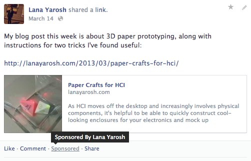
This is how a promoted post appears. It's fairly easy to see that it's promoted -- just a single text link saying "sponsored." Hovering over the link shows who promoted the post.

This is how a promoted post appears. It’s fairly hard to see that it’s promoted — just a single text link saying “sponsored.” Hovering over the link shows who promoted the post.

Procedure: On March 14th, I posted a blog entry about paper crafts for HCI and as usual added a Facebook post with the link to the entry. After a day, I recorded the initial interest in the post (12 views through the link, fairly low) and clicked the promote link. I then compared two weeks worth of views on this post to two other posts: one on auto-biographical research that had most similar initial interest after posting and another on quick device prototyping that was more similar in topic and also had a fairly close starting view count.

Results: There was definitely an initial bump in views the day that I promoted the Facebook entry, compared to the way view statistics generally look on the second day. However, this effect did not extend to the following days and by day three, both promoted and non-promoted posts look very similar in terms of views.
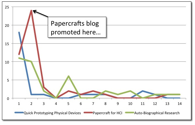
Number of views (y-axis) plotted against days since the entry was posted (x-axis) for the three blog posts, showing there was an initial bump in views when the blog was promoted, but by the next day the effect was gone.

Number of views (y-axis) plotted against days since the entry was posted (x-axis) for the three blog posts, showing there was an initial bump in views when the blog was promoted, but by the next day the effect was gone

Excluding the influence of the promotion day bump on the paper crafts entry, all three posts got very similar number of views by the end of the 14 days: 26 for quick prototyping, 37 for auto-biographical research, and 47 for paper crafts (if day 2 of paper crafts was more typical, it would have been about 39 views total).

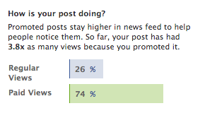
According to Facebook's report, the promoted post was seen by a lot more of my friends.

According to Facebook’s report, the promoted post was seen by a lot more of my friends.

However, though the total number of views was pretty much the same for all posts, I have a sense that different people saw this post than usually would have based on the people who “liked” the post on Facebook. Typically, my Facebook blog links are “liked” by the usual group of suspects (all dearly loved!). However, after the blog was promoted, it received “likes” only from people who had never previously “liked” one of my posts. Perhaps because Facebook (reasonably judging us to be acquaintances rather than close friends) quickly moved links to these posts “below the fold.” Promoting the post caused it to stay above the fold in the feeds of folks who otherwise would not have seen the entry for very long. Indeed, according to Facebook’s own statistics, the promoted post was viewed (but not necessarily clicked on) by 3.8 times as many users as a non-promoted post.

So, is promoting a blog post worth it? In terms of views, I don’t think that it’s worth doing every week. But, I can see periodically (once a year or something) promoting a post that highlights the blog to get new people who might be interested in becoming readers.

 

To Build or Not To Build: Role of Technology in Twelve-Step Fellowships

http://www.youtube.com/watch?v=A_PZwLmG0ls

At CHI 2013, I’ll be presenting the ultra-secret project that I’ve been working on for the past year and a half. (Why ultra secret? I was supposed to be 100% working on my dissertation at the time!) In this work, I investigate the role of technology in helping members of twelve-step fellowships (e.g., Narcotics Anonymous) recover from addiction or alcoholism [Full Paper]. I’ve already made a Follow the Crowd Blog post about this work that gives a bit of background and highlights some of the findings. And I didn’t want to just mirror it, but rather talk a little bit about what was interesting and surprising to me in doing this work.

As a researcher who designs and builds communication systems, videochat has kind of become the hammer with which I attempt to fix every situation. I went into this study, thinking that this was going to be another one of these cases. Wouldn’t it be cool if people could just attend meetings through videochat? Wouldn’t it be wonderful if AA meetings could be brought directly to jails, institutions, and rehabs through videochat without all of the (considerable) logistics of a physical visit? Going through the process of doing this study (attending more than 100 meetings and interviewing 12 participants in-depth) made me better appreciate why the twelve-step communities are wary of these approaches and why they coud present a huge problem to the community. Technology focuses on making things easier and more efficient, but through this it might actually be reducing opportunities to show effort, build community, and construct meaning.

In writing this paper, I (and the reviewers) asked myself “what would I build based on these findings?” and I’m not sure if I actually came out with an answer. I know I have a better sense of what wouldn’t work and a greater appreciation for the complexity and wisdom of the processes that are currently in place for twelve-step communities. Can I make it better with technology? Possibly, but I’m almost paralyzed by the fear of making it worse.

If there are other designers or builders who have found themselves in a similar position, I’m  curious to know how you have approached this struggle.

Paper Crafts for HCI

As HCI moves off the desktop and increasingly involves physical components, it’s helpful to be able to quickly construct cool-looking enclosures for your electronics and mock up components in a way that can explain your device to a user. There are lots of guides to help you prototype a 2D interfaces using paper (e.g., Snyder’s book) and reasons why you might want to use them, but I wanted to share some ideas for 3D paper crafts for prototyping. Why paper? It’s cheap, quick, not intimidating, and it looks like a prototype so the user doesn’t expect it to have full functionality. I find that I am more comfortable making mistakes when I work with paper (and making mistakes is how research gets done). Two of my favorite techniques for 3-D prototyping with paper are modular origami and cardboard tab-slot constructions.

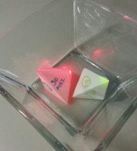
Two completed origami units representing time, each with an LED and an RFID tag inside. (See instructions)

Two completed origami units representing time, each with an LED and an RFID tag inside.

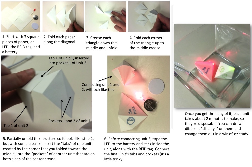
Geometric modular origami lets me make simple or complex hollow shapes from standard paper that hold together with the tension of the paper. A few additional dabs of glue can reinforce the design in the longterm. The awesome thing about this approach is that it requires zero equipment, usually I don’t even need scissors! Two collections of instructions that I’ve found most useful in my work are Origami Boxes and Unit Origami. But, just to get you started, I’ll walk you through an example. Lets say that I’m interested in figuring out if people can better understand and plan how they spend their time by representing time as small physical objects (a metaphor for a unit of time) placed into different RFID-enabled bowls (e.g., projects). At some point, these objects will have some electronics in them, but for an exploratory study it might be enough for me to convey to the user how these will eventually work. So, I’m going to create a bunch of pebble-like objects, each with an RFID tag and an LED using simple modular origami. Instructions below walk you though it… In this case, I might draw different “displays” or states on each one and swap them out as necessary in a wizard-of-oz or a cognitive walkthrough study.

Instructions for the origami pebbles. (Click for much larger view)

Instructions for the origami pebbles. (Click for much larger view)

A tab slot box for an Arduino and some other components created using the FlexBox template.

A tab slot box for an Arduino and some other components I created using the Flexbox template.

Origami is fun and a good start, but you might want something a bit more sturdy and functional. Cardboard is a great step up. Thick mounting board has essentially the same properties as thin wood (but cheaper) and you can use many of the same joints to keep things connected, but you don’t need any tool other than scissors or a blade knife to make it happen. But if you have access to FabLab, I recommend going with the laser cutter instead. Thingiverse is an excellent place to find templates to start. My personal favorite is this FlexBox parametric design. Download the postcript file and open it in any text editor to set your own parameters for the size of the box and the width of your cardboard. If you need additional modifications, just import the resulting postcript file into Illustrator and add whatever else you need (e.g., holes for wires). Once you laser cut it, the whole thing can be made more stable with a dab of glue or tape. The result looks pretty professional and is throw-away cheap to make.